Design isn’t one-size-fits-all – your app shouldn’t be either. Whether your users are tapping on a phone, browsing on a tablet, or navigating from a desktop, AppForceStudio lets you design responsively from the start. Here is how to Switch Between screen sizes and in AppForceStudio
Here’s how to toggle between device views in seconds:
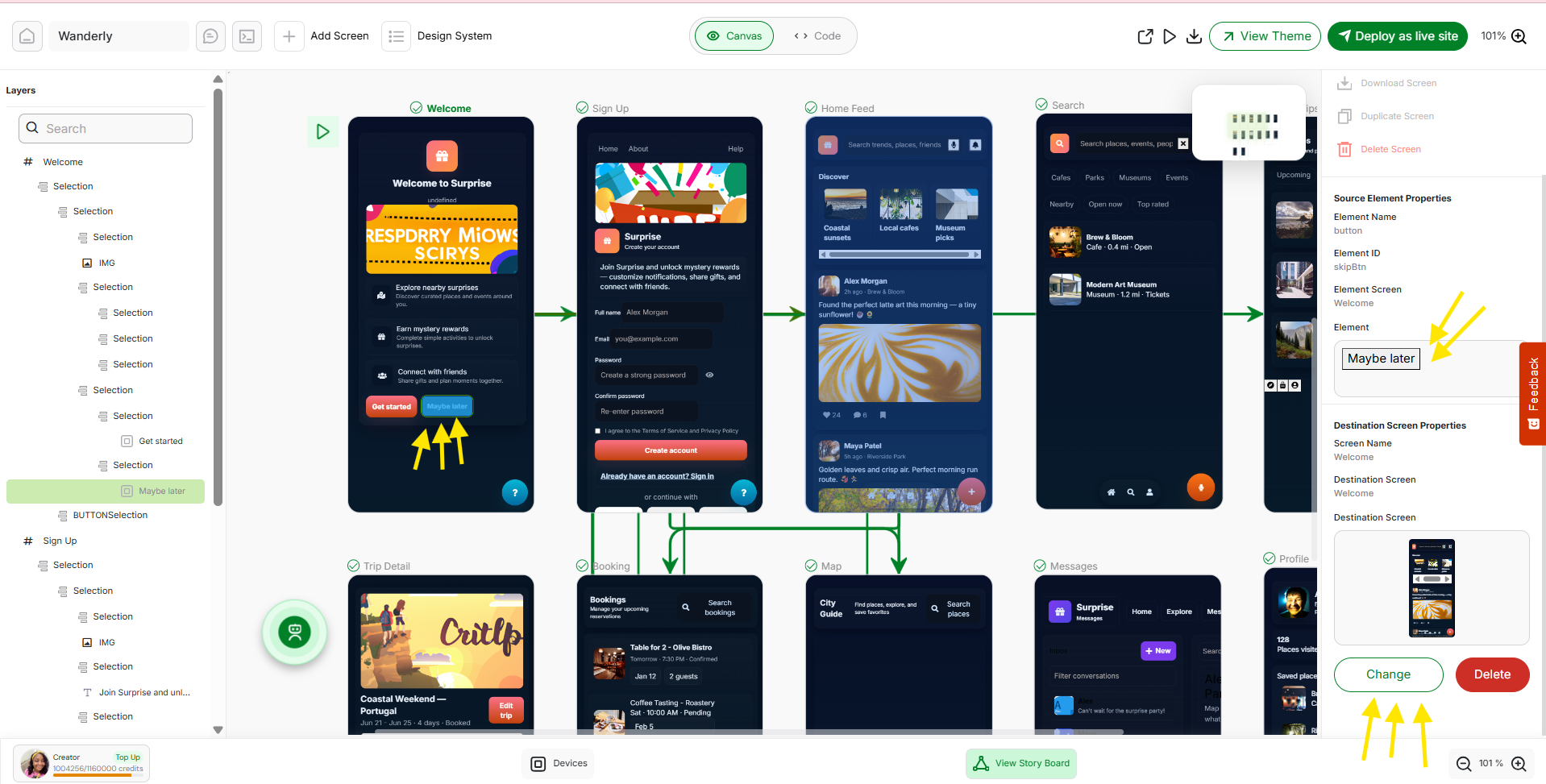
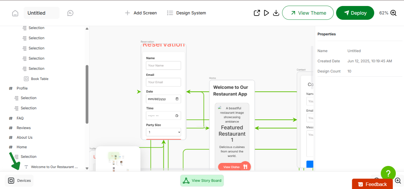
Step 1: Open the Playground
Launch your app project inside the Playground – your live building environment where you generate screens, code, and preview functionality.
Step 2: Click the “Devices” Icon
At the bottom left corner of the Playground, look for the Devices icon (usually a screen or frame symbol with the word “devices”). Clicking this opens the responsive view panel.

Step 3: Choose a View – Mobile, Tablet, or Desktop

Select your target device:
- Mobile: Ideal for smartphone-first UI/UX
- Tablet: Check mid-sized layouts like iPads
- Desktop: Preview full-screen responsive web experiences
The canvas will instantly resize to reflect the selected format, so you can see exactly what your users will see on each device type.
Why Switching Between screen sizes in AppForceStudio
✅ Design Responsively from Day One
✅ Catch Layout Breaks Before They Happen
✅ Deliver Pixel-Perfect UX Across All Devices
No need to wait till deployment. Test it. Tweak it. Ship it right.
With AppForceStudio, responsive design is fully baked in – not bolted on.